
Blog
Why Small Text 3D Prints Badly, and a Font Built to Fix It
November 17, 2026
A name or a serial number is the hardest thing on a part to print. We sliced the same tag in thirteen fonts to find out why, then drew Bead, a free font where every stroke is two nozzle passes wide.
A name on a keychain, a serial on a bracket, a size on a clip. The text is usually the smallest feature on the part, and it is usually the part of the print that looks worst. It is also the part you cannot leave off: a personalized product is the text, and a serialized part is only traceable if the number is readable.
We wanted to know why text slices so badly, so we set the same 13-character tag in thirteen fonts and read the G-code.
The stroke is the wrong width
Fonts were drawn for ink. Their stroke widths were chosen to look right on a page, and they have no relationship to the width of the line your nozzle lays.
A slicer builds a shape from walls. If a letter's stroke is exactly two lines wide, it gets one wall out and one wall back, and that is the whole stroke. If the stroke is a little wider, the slicer still lays two walls and then has to patch the sliver between them. That patch is gap fill: thin, short moves, each with its own start and stop.
At a 5.6 mm cap height, a bold sans has strokes about 1 mm wide. That is two and a half lines on a 0.4 mm nozzle, the worst width there is.
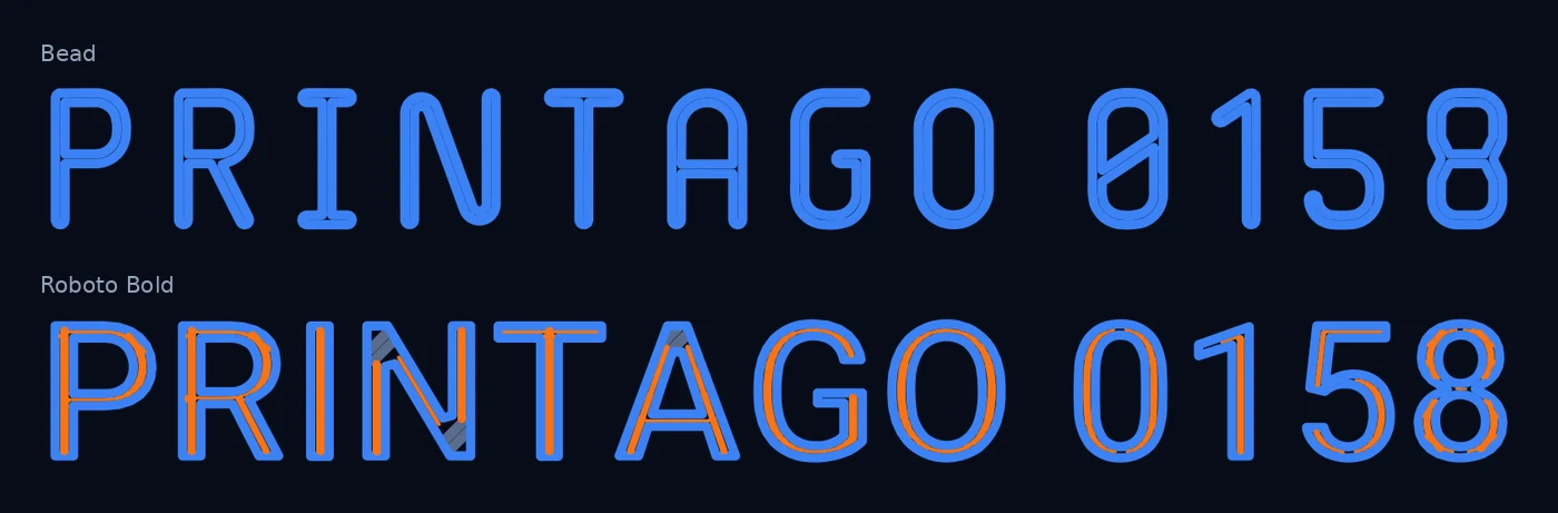
Blue is wall. Orange is gap fill. Both tags say PRINTAGO 0158 at the same height, sliced in OrcaSlicer 2.3.0 with the stock Bambu Lab A1 0.20 mm profile.
| Raised text, three layers | Separate paths | Gap fill |
|---|---|---|
| Bead | 60 | 0 mm |
| Roboto Bold | 702 | 403 mm in 633 pieces |
Roboto is not unusual. Inter, Open Sans, Montserrat and Liberation Sans in bold, and Oswald in semibold, all landed between 290 and 433 mm.
What people do about it today
The common advice is to use a thin font with even strokes and scale it until the stroke is about 0.6 mm. It works. Overpass Regular, Roboto Regular and Osifont all sliced our raised tag with no gap fill at all.
The cost is hidden in the walls. A 0.6 mm stroke is one and a half lines wide, and the slicer still lays two. They overlap, so those fonts put down 9 to 31% more plastic than the letter's area. You also find the right size by trial, one font and one nozzle at a time.
A font drawn in line widths
Bead starts from the nozzle. Each letter is a center line with a stroke of exactly two extrusion lines around it: 0.80 mm at a 0.42 mm line width and 0.2 mm layers. The spaces follow the same rule.
- Strokes are two lines. One wall out, one wall back, nothing to patch. Bead lays 94% of the letter's area, the same as a well-fitted bold font, with none of the gap fill.
- Counters are four lines. When text is cut into a surface, the plastic inside an 8 or a B is what prints. Four lines is two walls from each side.
- Letters sit six lines apart when cut in. Closer than that and the walls of neighboring letters merge and leave slivers.
- Look-alikes are kept apart. A slashed zero, a flagged 1 against a barred I, an 8 that cannot be read as a B. Serials have to be read back correctly.
Cut-in text is where the spacing rules pay off:
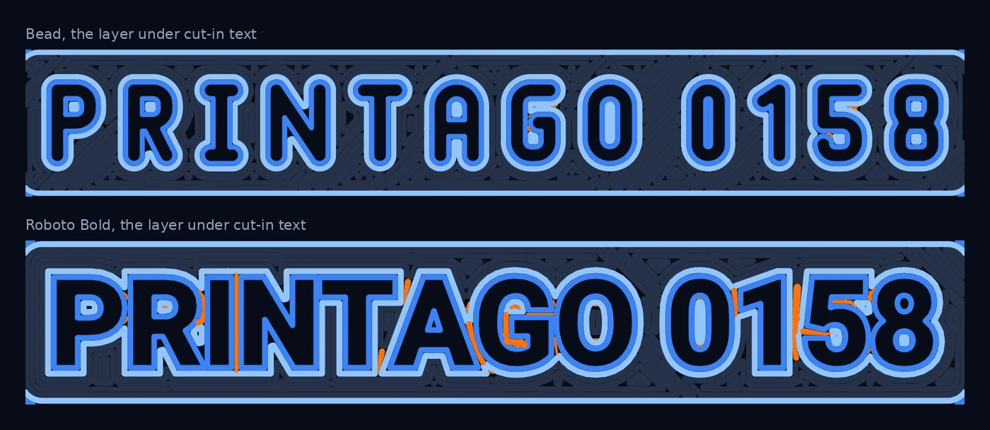
| Cut-in text | Gap fill, top layer | Gap fill, layer below |
|---|---|---|
| Bead | 1.4 mm | 2.7 mm |
| Overpass Regular | 10.3 mm | 29.5 mm |
| Roboto Bold | 28.2 mm | 38.7 mm |
The full comparison across all thirteen fonts, with the toolpaths for each one, is on the Bead page.
Bigger nozzles use the same files
Every dimension in Bead is a multiple of the stroke, and the stroke is two lines of your nozzle. So a bigger nozzle does not need a different font. It needs taller text: 8.2 mm on a 0.6 mm nozzle where a 0.4 mm nozzle uses 5.6 mm. We sliced that setup too, with the stock 0.6 mm profile, and the pattern held: 0.6 mm of gap fill raised and 2.4 mm cut in, against 408 mm and 40 mm for Roboto Bold.
Using it in Printago
Printago's text builder has Bead built in. Add 3D text to a model in Bambu Studio, set it in Bead Small, name the object so it starts with PrintagoParam, and upload the 3MF. Printago redraws that text for every order or every serial without you uploading the font. That is how Serial Numbers stamps a consecutive number into each unit, and how a personalized name gets from a storefront order onto the part.
Smaller clean text means a serial fits on a smaller part, and a name fits on a product that had no room for one.
What we have not done
Everything above is measured from the G-code the slicer wrote. We have not yet run a controlled print comparison, and gap fill under a cut-in surface may never show on a real part. Bead also has no accented letters yet.
The Bead page has the font files and test plates for 0.4 mm and 0.6 mm nozzles, each with Bead next to a bold sans at three sizes. Print one and see how the two compare on your printer.
Frequently asked questions
Sign up for free today
No credit card required. Connect unlimited printers and get production automation running in minutes.